
Design for a space mission
Design telemetry data interface for the Iris Rover for its 2021 mission to the Moon.
Iris rover is the first private academic rover developed by Carnegie Mellon University, NASA and Astrobotic, and will land on the moon in July 2021.
Problem
When the Iris Rover lands on the Moon, all sensors onboard will start either collecting data or monitoring the rover. How do operators monitor the health of the Iris Rover and troubleshoot when anomalies occur?
Solution
Create a telemetry data dashboard where operators can monitor onboard sensor data as well as look into data details for troubleshooting.
My role
Conduct user research
Define features and workflows
Design and iterate wireframes
Facilitate user testings
Apply the Cosmos design system to design high-fidelity prototypes
Conduct usability test in paper missions
Deliver design specs
Team
Diana Zhan
Shan Wang
Duration
Sep, 2019 - Aug, 2020
Iris on media

A data panel for space rover operators to monitor the rover and troubleshoot anomalies during the mission
Dashboard
To give operators a holistic view of the status of the rover

Detail pages
To enable operators to investigate further into the data from sensors

Error tagging
To guide operators to document errors or anomalies during the mission.
Error analysis
To help operators identify and analyze errors by showing data from different sensors

The Process
1.
Discover
- Gather information from operators
2.
Define
- Identify data architecture
- Categorize data
- Prioritize features
3.
Design
- Sketch out initial design ideas
- Define workflow
- Iterate wireframe designs
- Move on to high-fi deisgn
4.
Deliver
- Finalize design with Cosmos design system
- Test in paper missions
1. Discover
Gather information from operators
All of us were new to this area, so we decided to start from understanding user needs, the rover operators. We talked to many engineers and operators before conducting a vast amount of secondary research, which gave us more confidence in moving forward.

“ ... the raw data can be helpful for post-mission analysis, but the team needs to monitor the inferred value during mission to ensure proper performance of all criticle components.”
- Lou, System Engineer
“ The main goal of the telemetry interface is to monitor the overall health of the rover, and warn the team if something goes wrong.”
- Raewyn, Flight Operator
“ ... a lot of times the failures require human analysis and cannot fully rely on auto-generated error messages.”
- Connor, Flight Software Engineer
What operators need?
1.
Monitor the overall health of the rover
Operators need to check the data from dozens of sensors onboard to monitor the health of the rover.
2.
Check detailed historical data for analysis
Operators need detailed data to analyze the health condition of the rover.
3.
Troubleshoot when anomalies occur
When things go wrong, operators need to troubleshoot as soon as possible to avoid mission failure.
2. Define
Identify data flow
We developed a data architecture illustrating the flow of information in the system based on findings from our research and interviews.

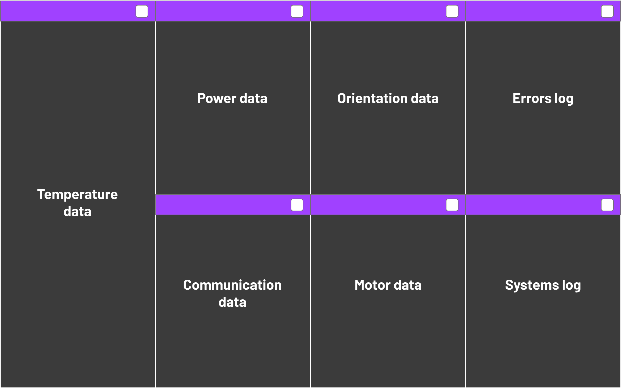
Categorize data
Based on the data structure, we categorized data from all types of sensors into different sections. Data in the "Integrated Visualization" and "Error Messages" columns are the key elements of the telemetry interface.

Create and prioritize features
We further examined the data categories and came up with a more specific feature list for each data category. We then prioritized the features to guide the design later on.

Align features with user needs
1.
A dashboard presenting a holistic view of sensors
Give operators an overview of current rover status
2.
Detail pages showing historical data for analysis
Enable operator to further investigate the rover by delivering historical data of onboard sensors
3.
Error tagging and analysis for troubleshooting
Help operators record and further analyze anomalies occurring during the mission
3. Design
Generate workflows
Based on user needs and features, we proceeded to generate workflows to clarify the interactions.
Monitoring
To show operators a holistic view of data and navigate to detailed historical data pages when necessary
Error tagging
To guide operators to document anomalies that occur on sensors step by step.
Error analysis
To assist operators in investigating documented errors for troubleshooting.


Ideate interface layout
We initiated our ideation with Crazy 8 practice (coming up with eight ideas in 8 minutes). After synthesizing our ideas, we came up with the dashboard design as follows. We applied a module design and arranged the data categories according to the prioritization based on our research.


Design user interface
After figuring out the layout, we started to design the interfaces in detail. We explored various ways to present data on pages.

Iterate wireframes
After deciding on our design direction, we built and iterated low-fidelity wireframes in Figma. Being able to collaborate quickly and effectively on Figma really helped us save a lot of time on synchronization.
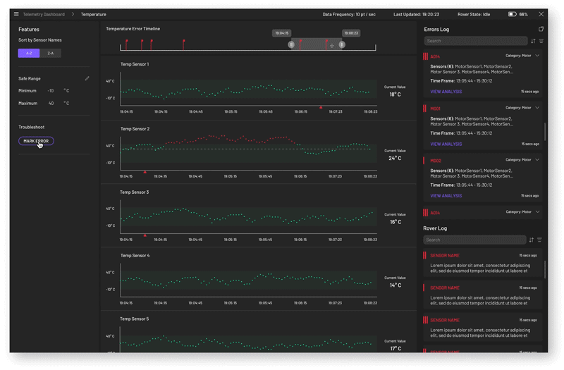
Dashboard
We applied module design on the dashboard to give operators a holistic view of the rover. By presenting only real-time data, our dashboard minimizes operator’s effort on monitoring the overall status of the rover.

Detail page
By listing all sensors in the same category vertically, the detail pages enable operators to investigate and compare data across sensors easily. On detail pages, operators can also edit the “safe zone”” threshold for specific sensors.

Error analysis
We listed all errors on the left and detailed data graphs in the middle for the convenience of the operators' investigation.

Feedback from operators
Throughout the design process, we kept testing our wireframes with operators and collected really helpful feedback to constantly improve our design. Here are some highlights that have led to significant design changes later on.
1.
No "real-time" data
There is a 4-second delay in all data transmission due to long distance, which means the “real-time” data is not quite exactly “real-time”.
Design changes
Show the "last updated time" at the top of the screen.
2.
Historical data over a short period of time is more valuable for monitoring.
Single data points of sensors on the dashboard are not very helpful for monitoring.
Design changes
Instead of only showing “real-time”data, we decided to add historical data over a five-minute period to the dashboard.
3.
Troubleshooting requires data comparison
To troubleshoot anomalies, operators need to check data from multiple sensors at the same time for investigation.
Design changes
When an anomaly occurs, all data at the time, including images, will be saved to the error card.
A false alarm of bandwidth limitation
During the design, our team found out that the bandwidth of the rover was not enough to transmit all data at once. This means we may have to use multiple parcels. Asynchronous data would pose a lot of challenges to data visualization. Fortunately, we solved this issue by partnering with a company that offered us extra bandwidth for the mission.
Although a brief interlude, this was actually tip of the iceberg. The challenges we encountered working on this project really made it an exciting journey.

Challenges
1.
No experience in space missions
Lack of experience in space missions was a big challenge for us. We talked to many operators, engineers and conducted substantial secondary research to reduce the knowledge gap.
2.
Work with multi-discipliary teams
Throughout the process, we worked with multi-disciplinary teams, including engineers, operators, etc. Communication among groups with different expertise often requires “translations”. We learned many languages from others.
4. Test and Deliver
Finalize design with Cosmos design system
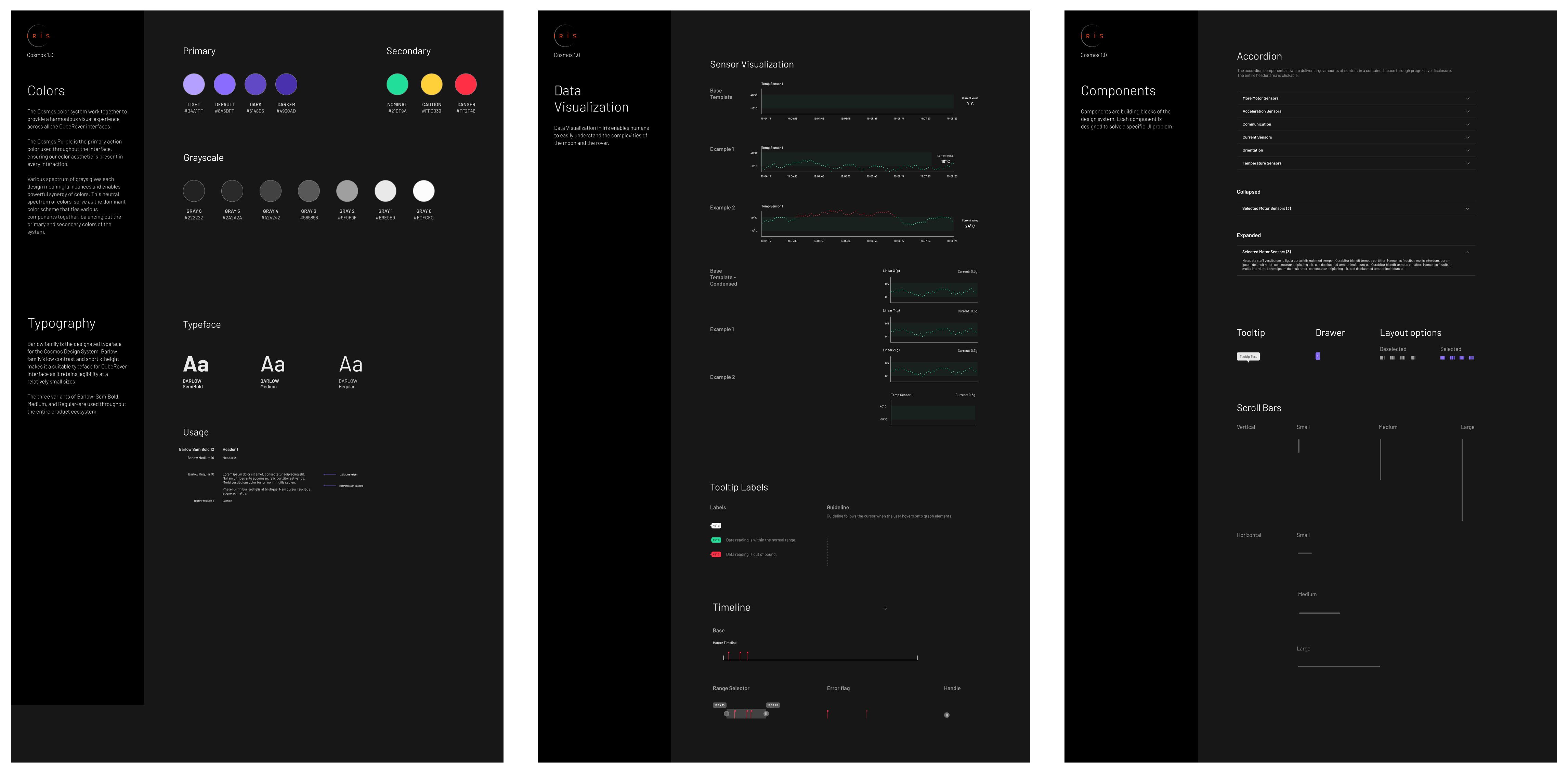
After rounds of iteration on wireframes, we finally moved on to high-fidelity design. We worked closed with the Cosmos team who would determine the overall look (components, colors, styles, etc.) for all interfaces. In the meantime, we also kept updating our design based on feedback from developers.
Cosmos design system
Dashboard
To give operators a holistic view of the status of the rover.
Detail pages
To enable operators to investigate further into the data from sensors.
Error tagging
To guide operators to document errors or anomalies during the mission.
Error analysis
To help operators identify and analyze errors by showing data from different sensors.
Value proposition
1.
A holistic view of sensors on the dashboard informs operators of the status of the rover quickly.
2.
Detailed historical data pages enable operators to investigate abnormalities efficiently.
3.
Error marking process enables operators to document abnormalities for future study/investigation easily.
4.
All-embracing data on the error analysis page improves troubleshooting efficiency.
Test in paper missions
After we had complete the high-fidelity prototype, we ran paper missions with rover operators and engineers to test our design. During the paper mission, we asked them to complete some tasks on the prototype to see if the design made sense.

Feedback and next steps
We have received very positive feedback from operators and engineers! But according to their feedback, there are still some minor details, and features need to be adjusted. For example, operators want to document errors through the dashboard when abnormalities occur. For the next step, we will keep iterating on the prototype and assist developers in implementation.
"The dashboard looks good, everything I expected is there."
- Meghan Cilento, Systems Engineering Lead
"I'm pretty happy with that (error marking proess)!"
- Raewyn Duvall, Flight Operator
"It will be helpful to be able to see everything else (other sensors) in the error (analysis page), when it (a sensor) starts to go out of range… you may start to see something else is going wrong."